Pub­lic archi­tec­ture wraps pub­lic art.

The Rocks is one of the most sig­nif­i­cant her­itage precincts in Syd­ney, with many intact build­ings and streetscapes dat­ing back to Euro­pean set­tle­ment in the eigh­teenth century.

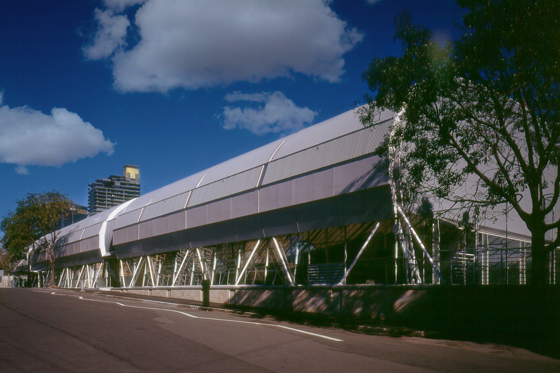
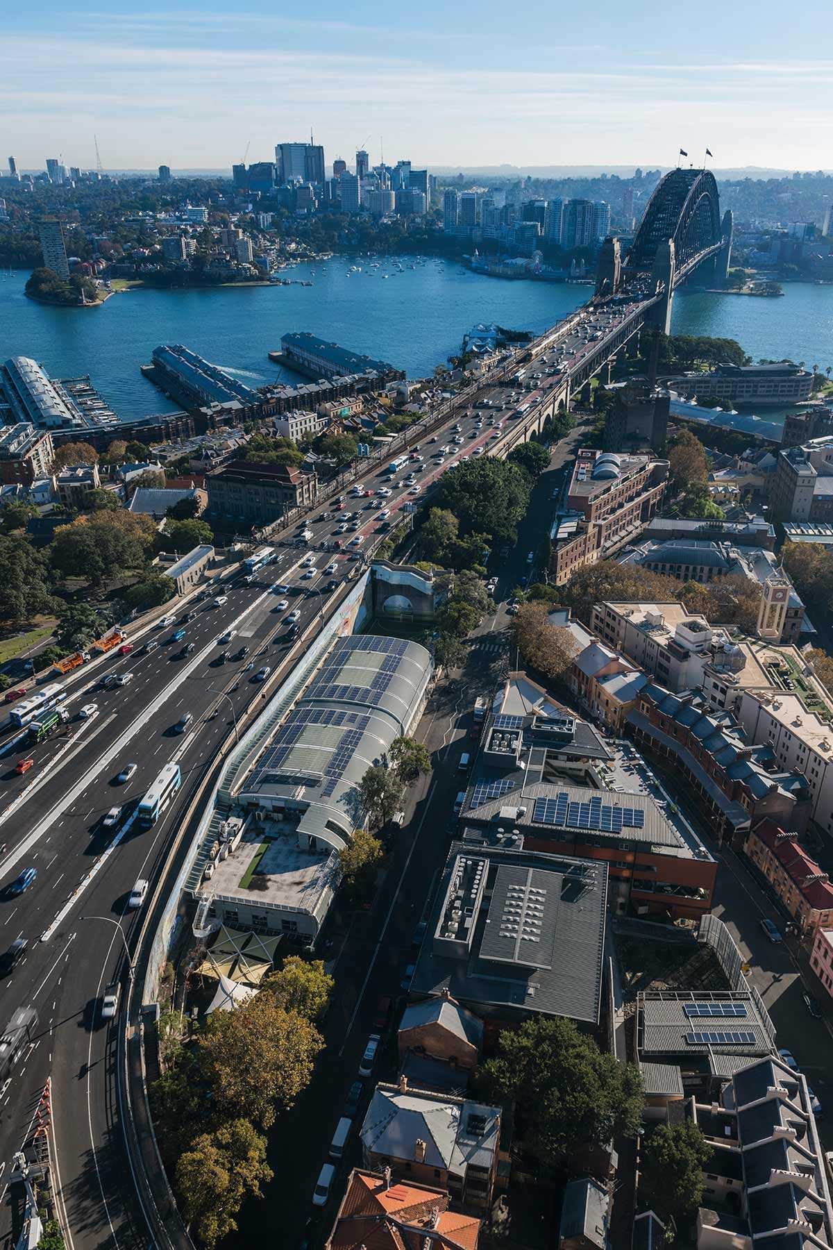
Few con­tem­po­rary build­ings can be found here. How­ev­er, there is one build­ing, locat­ed at 15 Cum­ber­land Street that con­tin­ues to slow traf­fic along the Cahill Express­way where it’s locat­ed. The Syd­ney City Coun­cil brief, required replace­ment of a dilap­i­dat­ed out­door facil­i­ty: two out­door bitu­men courts and a crude storage/​reception build­ing, with a new recre­ation cen­tre for the local com­mu­ni­ty and city work­ers. The brief for the replace­ment indoor facil­i­ty was for two mul­ti-func­tion­al courts suit­able for net­ball, bas­ket­ball or vol­ley ball, togeth­er with a gym­na­si­um, com­mu­ni­ty room and child­care facilities.

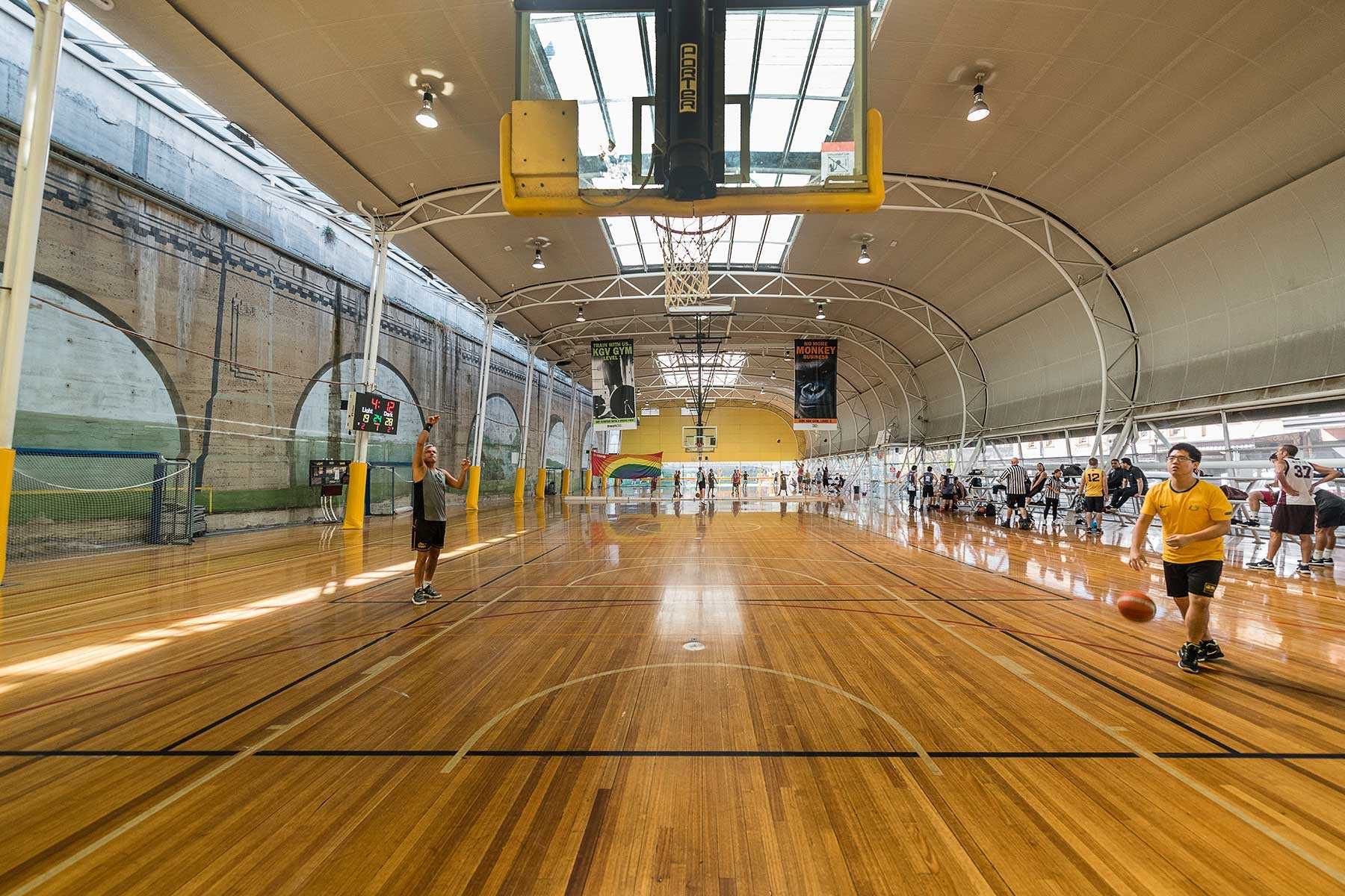
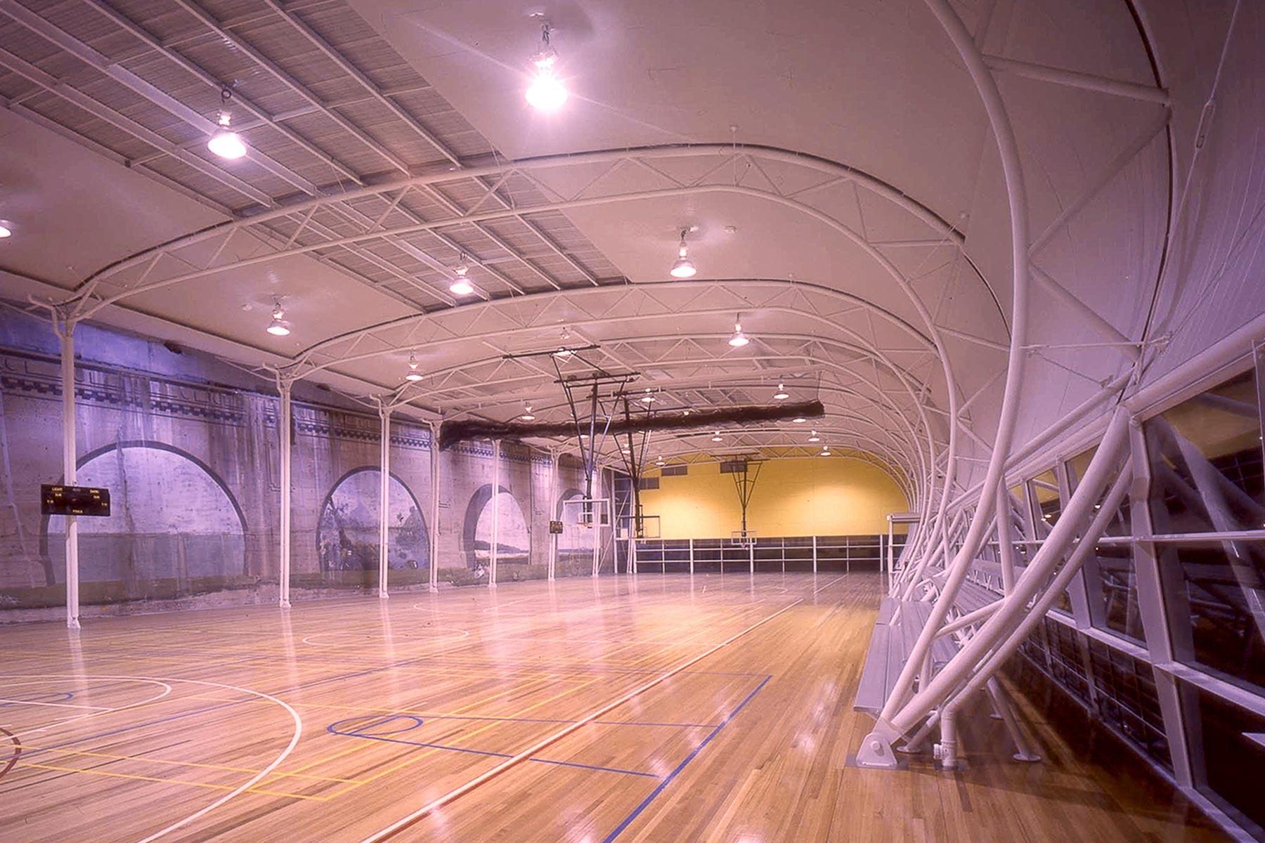
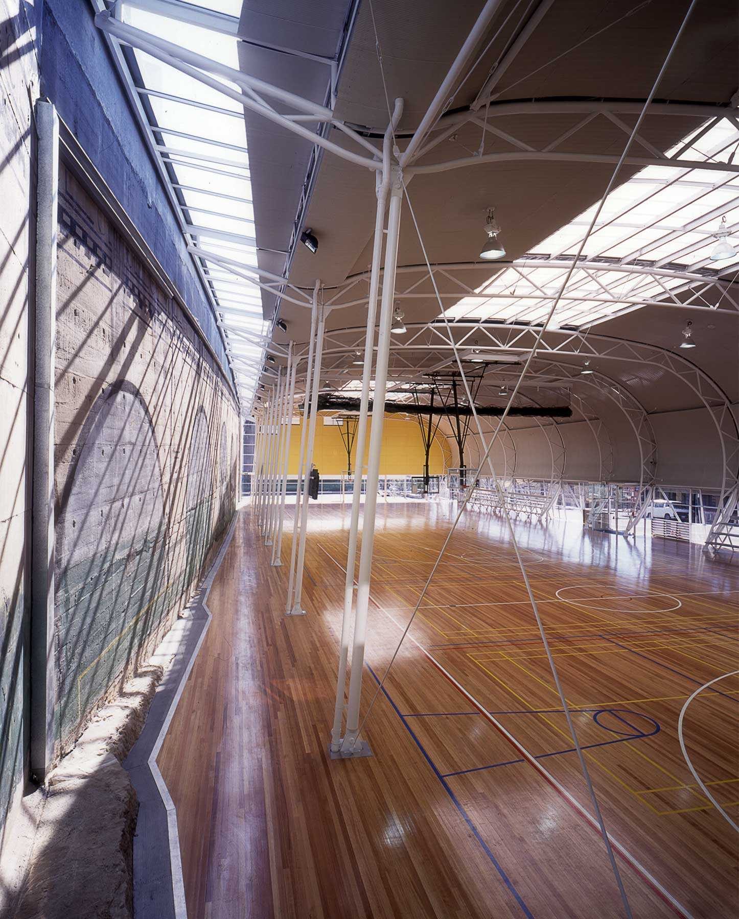
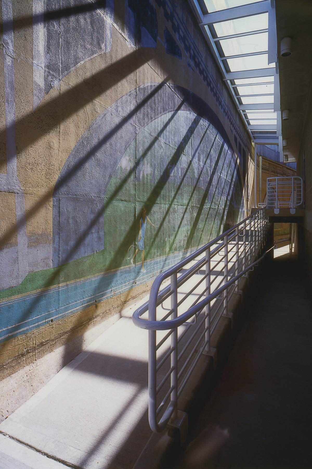
One of the key require­ments from the City of Syd­ney was that the trea­sured mur­al paint­ed on the wall of the Cahill Express­way by artist Peter Day in 1983 had to be pro­tect­ed. And not just pro­tect­ed, but the brief required the trompe l’oeil mur­al with dis­tinc­tive arch­es and Syd­ney Har­bour scenes to be vis­i­ble to passers-by on Cum­ber­land Street! A very tall order” as Lipp­mann recalls. The oth­er stip­u­la­tion was that the roof of the new struc­ture could not block views from the Cahill Express­way above, while still allow­ing suf­fi­cient clear­ance above the new courts (up to 9 metres in height). So, to the west the views had to be main­tained as well as those to the east, with peo­ple still able to see Day’s mural.
What began as an impos­si­ble brief, gave rise to one of the city’s most pop­u­lar and high­ly patro­n­ised recre­ation centres.

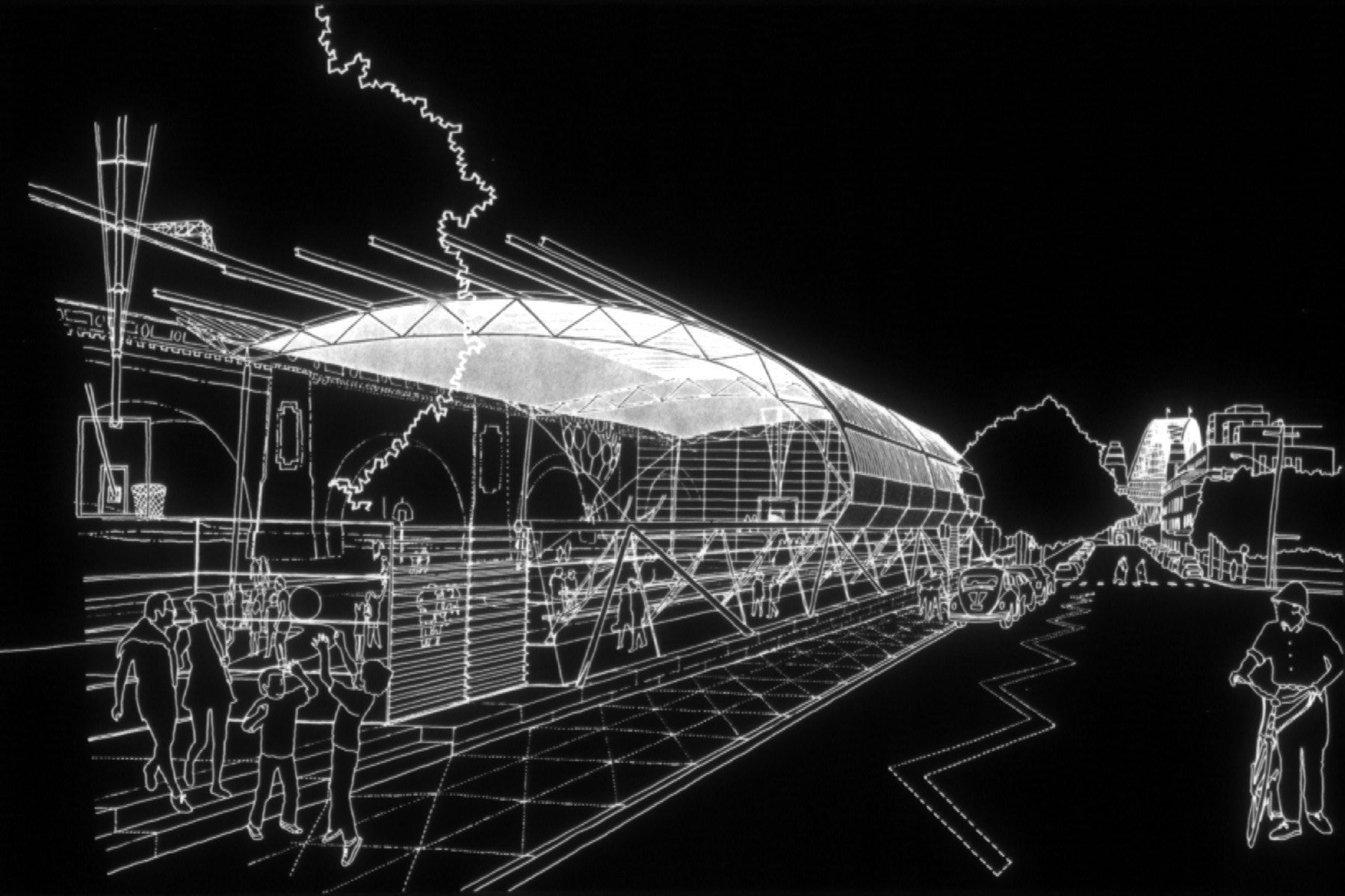
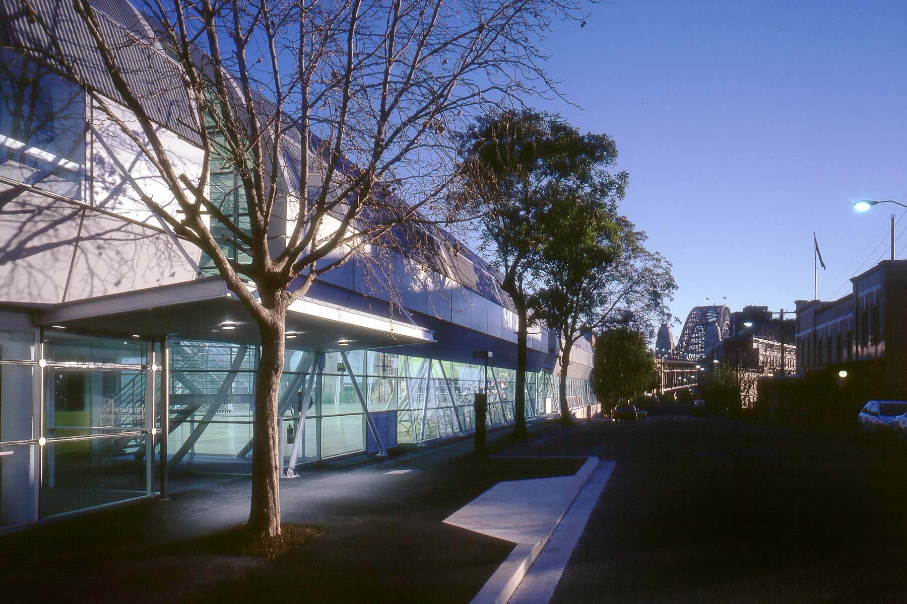
Many dif­fer­ent options were con­sid­ered before the wave-like form was finalised and devel­oped. This cross-sec­tion ensured that the height of the roof was low yet com­pli­ant with reg­u­la­tions sports’ stan­dards whilst, impor­tant­ly, the street wall remained low and inti­mate, respect­ing the three-sto­ry scale of its her­itage con­text. The wave roof abutted the Cahill Express­way allow­ing the mur­al to become an inte­ri­or ele­ment of the space. This idea togeth­er with the glazed wall to the street, ensured the mur­al was not just vis­i­ble but cel­e­brat­ed by users and passers-by.

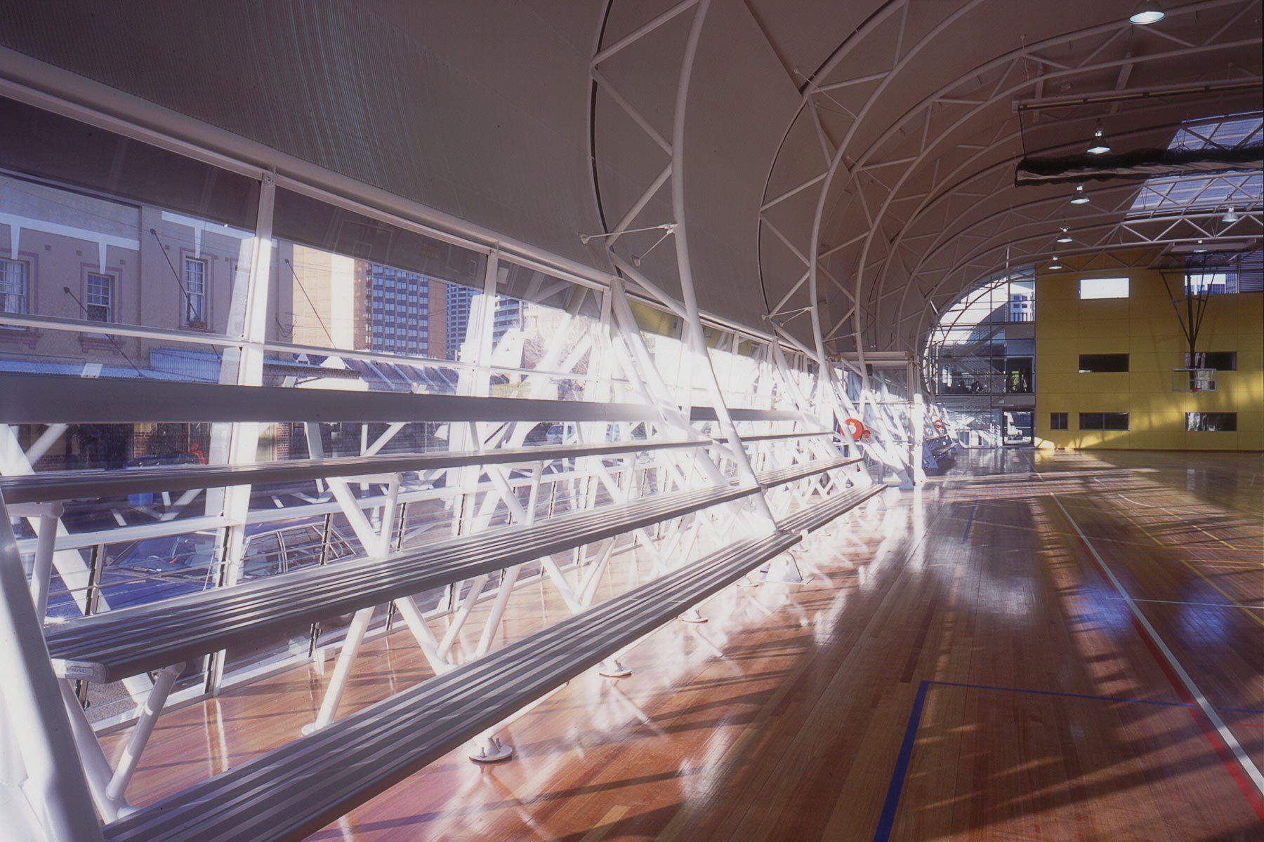
By any stan­dards, the solu­tion would have pleased vir­tu­al­ly every­one at Syd­ney City Coun­cil. It also met their bud­get of approx­i­mate­ly $3 mil­lion, even then con­sid­ered rel­a­tive­ly mod­est for a build­ing of this scale. There weren’t suf­fi­cient funds to include air con­di­tion­ing, so it made more sense to have lou­vred win­dows and purge the warm air through the top lou­vres (fram­ing the ceil­ing),” says Lipp­mann, who inte­grat­ed expressed steel beams and truss­es in the design. 

While Lippmann‘s scheme sat­is­fied his client’s brief and was pop­u­lar with local res­i­dents, con­sent for the project locat­ed in The Rocks, need­ed to come from the Syd­ney Cove Rede­vel­op­ment Author­i­ty (SCRA) who’s expec­ta­tion of a brick bond store or his­tori­cised façade was met by Lippmann‘s more chal­leng­ing 21st cen­tu­ry response. The design was not in align­ment with the SCRA’s expec­ta­tions but I assumed that because my client was hap­py the project we’d sail through the approval process. I didn’t realise that my clients were hav­ing prob­lems with SCRA and were con­sid­er­ing sack­ing me from the project”.

SCRA was even­tu­al­ly con­vinced that the pro­pos­al wasn’t sim­ply a con­tem­po­rary glass box, but had con­sid­er­able tex­ture and was an appro­pri­ate response to the strin­gent para­me­ters of the Coun­cil brief on a vir­tu­al­ly vacant site.

Not sur­pris­ing­ly, Lipp­mann man­aged, in the end, to obtain approval and over 20 years after the cen­tre was com­plet­ed, is amused to reflect that the result­ing struc­ture was a major hur­dle, giv­en the suc­cess the cen­tre has had over this time,” adds Lipp­mann. Hav­ing the cen­tre used by ath­letes as a warm-up space for the 2000 Olympics cer­tain­ly helped kill off any rem­nant com­plaints about the building.”

The King George V Recre­ation Cen­tre not only addressed the issues apper­tain­ing to the building’s enve­lope, but clear­ly addressed the inte­ri­or require­ments, the angled glazed walls to the east­ern ele­va­tion (Cum­ber­land Street) allow­ing space for the bleach­ers, avoid­ing the loss of valu­able space on the courts. These tough­ened glass walls also pre­vent stray­ing balls from caus­ing dam­age. On the func­tion­al side, locat­ed with­in a sep­a­rate­ly con­tained build­ing to the south, and con­nect­ed via a link, is the com­mu­ni­ty room and offices at ground lev­el, togeth­er with chang­ing rooms. The upper lev­el is then giv­en over to a gym­na­si­um and a sep­a­rate space for aer­o­bics. And between the two forms is a tri­an­gu­lar-shaped out­door play area that leads direct­ly from the com­mu­nal space. 

The King George V Recre­ation Cen­tre received an archi­tec­ture award from the Aus­tralian Insti­tute of Archi­tects in 1998 when it was com­plet­ed. It’s still a favourite place for local res­i­dents and Syd­neysiders as it con­tin­ues to adapt to the needs of the com­mu­ni­ty. A play­ground not orig­i­nal­ly afford­able was added in 2006, a num­ber of inte­ri­or upgrades were car­ried out and a new mur­al was paint­ed on the east­ern inte­ri­or wall in 2018, with the artist invit­ing Lipp­mann to col­lab­o­rate in its cre­ation. Archi­tec­ture should evolve and adapt with time. I’m not threat­ened by that or pre­cious about change as long as its sen­si­tive and main­tains a dia­logue with the orig­i­nal. Change can be an oppor­tu­ni­ty for improve­ment if client and archi­tect are like mind­ed and cog­nisant of the val­ue of the orig­i­nal” adds Lippmann.

by Stephen Crafti

Acknowl­edge­ments

  • 1999 Urban Design Award
    Aus­tralian Insti­tute of Architects
  • 1999 Win­ner Com­mu­ni­ty Recre­ation
    BHP Met­al Build­ing Awards

Project details

  • Loca­tion
    The Rocks, Sydney
  • Client
    City of Syd­ney Council
  • Key con­sul­tants
    TTW
  • Builder
    Build­corp
  • Pho­tog­ra­phy
    Farshid Assas­si, Willem Rethmeier